Thursday 28 February 2013

Georgian architecture - geometric presentation

Recently, I did a shoot in Leamington Spa, and to remove perspective distortion as much as possible, I brought a step ladder to further level myself with the centre of the photographs. Some Photoshopping was required to finish off the perspective correction (a 5x4 camera wasn't available at the time of the shoot).

The reason for this is so that the buildings are seen front on with no distortions, meaning that the viewer will focus their attention instead onto the repetition, symmetry, and carefully geometric presentation of Georgian Architecture.


Thursday 21 February 2013

Georgian Architecture - 'The Perfect House'


This is a montage I made (in Photoshop) using elements of multiple examples of Georgian architecture (shot in Leamington Spa). The idea is to create 'The Perfect Georgian House', and make it as realistic and seamless as possible. At the moment, if you look closely, the seams do show. Note: The shadow of the pilaster was created by outlining a shadow (using the pen tool) from a similarly shaped entrance and colouring in the selection.


Wednesday 6 February 2013

Georgian architecture - refinement of 'blacked out' presentation concept

After a recent shoot in Leamington Spa, I thought that perhaps the problem with the presentation concept in it's current form is because the roughly cut out edges of the architecture contrast too sharply with the black background.

So, an variant experimented with the Leamington Spa photographs was to darken the background, not remove it and replace it with a solid backdrop. One of the resulting effects is that the building remains in its real life location, while heavy focus still being placed on the central subject. This could also allow the viewer to observe the architecture of the surrounding buildings to see if they are of similar style. For example, if the subject was added later, or is the remains of a period in history, that has been demolished around it.

In the example below, the building is more isolated, which could mean that it is a 'sole survivor' of that architectural style, especially as the other buildings visible in the frame are of a differing shape and style.


The original photograph. In future, a less bright day may be more desirable, as shadows could break the isolation/separation from surroundings that may be followed up in the future presentational styles.

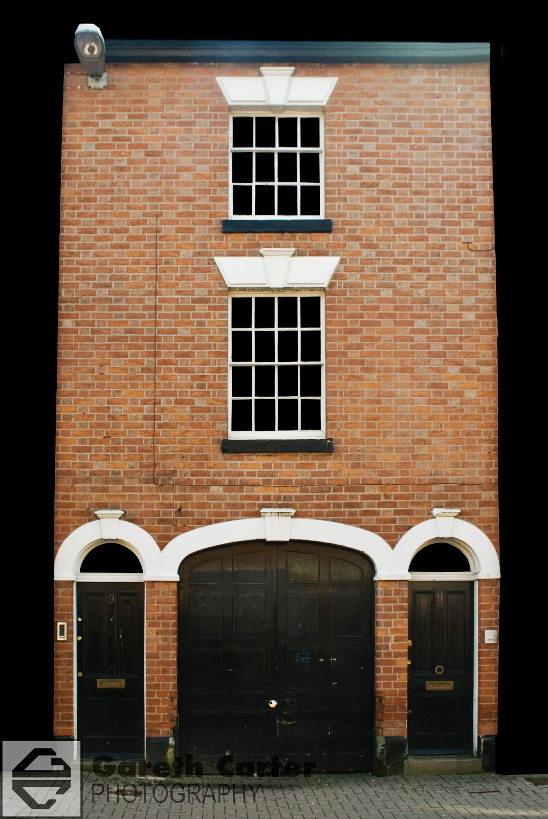
The first idea of blacked out windows and background continued on from Leicester shoot.

Slight alteration to previous style, where the background is darkened, but still visible. The harsh contrast between subject and background is lessened, but still prevalent.

The latest variant, where the foreground in front of the central subject has also been darkened, so that only the building and it's immediate surroundings (no further than the front wall) are of the normal lighting. This results in a more geometric shaped central subject.


Georgian architecture - presentation idea

To focus on the various aspects of Georgian Architecture, and inspired by Edgar Martins photograph from the last post, the window panes and background have been digitally blacked out in post-production in this photograph taken in Leicester.

Overall, this is an interesting style of presentation. However, in it's current form it is too 'rough', which makes it look amateurish. Therefore, some refinement will be required, should this concept be continued.

Lighting is also a problem as evidenced by the hot spot at the top-right of the building.